tMoA

Would you like to react to this message? Create an account in a few clicks or log in to continue.
tMoA

~ The only Home on the Web You'll ever need ~

+10
hippihillbobbi
Mercuriel
GODDESS OF PURPLE LIGHT
Bobbie
burgundia
mudra
SiriArc
devakas
Carol
NewWorldKarma
14 posters

    New banners, Members please take a look and decide

    GODDESS OF PURPLE LIGHT
    GODDESS OF PURPLE LIGHT


    Posts : 285
    Join date : 2010-04-10
    Location : Oxford United Kingdom

    New banners, Members please take a look and decide - Page 2 Empty Re: New banners, Members please take a look and decide

    Post  GODDESS OF PURPLE LIGHT Thu Apr 15, 2010 1:19 pm

    NewWorldKarma wrote:Heres what i came up with tonight, its not complete need to add my new crest (hopefully when its complete) and the text etc. do that tomorrow.

    New banners, Members please take a look and decide - Page 2 28rzfol

    isnt the best.

    NWK.

    This one is really reaaaally nice! Very Happy Very Happy
    bounce bounce
    BEAUTIFUL!!!
    alien alien alien
    flower flower flower
    NewWorldKarma
    NewWorldKarma


    Posts : 56
    Join date : 2010-04-10
    Age : 39
    Location : England

    New banners, Members please take a look and decide - Page 2 Empty Re: New banners, Members please take a look and decide

    Post  NewWorldKarma Thu Apr 15, 2010 5:08 pm

    Here it is complete. I think this one looks grand.

    New banners, Members please take a look and decide - Page 2 Icon_cool

    New banners, Members please take a look and decide - Page 2 1z4a0hs

    :)

    NWK.
    mudra
    mudra


    Posts : 23207
    Join date : 2010-04-09
    Age : 69
    Location : belgium

    New banners, Members please take a look and decide - Page 2 Empty Re: New banners, Members please take a look and decide

    Post  mudra Thu Apr 15, 2010 6:03 pm

    I Love that banner more and more NWK New banners, Members please take a look and decide - Page 2 Icon_cheers
    It's beautifull New banners, Members please take a look and decide - Page 2 Icon_sunny

    A small remark still though :
    The idea of the sword in the back is nice but it took me
    several seconds to realize what it was .

    Could you post the same banner without the sword behind the letters
    to see how this looks then ?

    Thank You New banners, Members please take a look and decide - Page 2 934918

    Love from me
    mudra
    NewWorldKarma
    NewWorldKarma


    Posts : 56
    Join date : 2010-04-10
    Age : 39
    Location : England

    New banners, Members please take a look and decide - Page 2 Empty Re: New banners, Members please take a look and decide

    Post  NewWorldKarma Thu Apr 15, 2010 7:13 pm

    New banners, Members please take a look and decide - Page 2 Icon_surprised

    New banners, Members please take a look and decide - Page 2 Fjdg1t

    Night all.

    NWK.
    mudra
    mudra


    Posts : 23207
    Join date : 2010-04-09
    Age : 69
    Location : belgium

    New banners, Members please take a look and decide - Page 2 Empty Re: New banners, Members please take a look and decide

    Post  mudra Thu Apr 15, 2010 7:24 pm

    Comparing both .. I now see that this sword gave that banner a little bit of extra punch that the one without it does'nt have .
    I think you did an awesome job NWK .
    I Love the banner as you designed it . I would'nt change anything to it New banners, Members please take a look and decide - Page 2 Icon_cheers
    Let's see what others say ..

    Thank You New banners, Members please take a look and decide - Page 2 934918

    Love from me
    mudra
    Carol
    Carol
    Admin
    Admin


    Posts : 31679
    Join date : 2010-04-07
    Location : Hawaii

    New banners, Members please take a look and decide - Page 2 Empty Re: New banners, Members please take a look and decide

    Post  Carol Thu Apr 15, 2010 8:14 pm

    Both E.T.s and NWK's banners are beautiful. I'm stunned at what E.T. did as the concept I was trying to convey is there. I like the type to be at the bottom of the image so the artwork is displayed as much as possible.

    New banners, Members please take a look and decide - Page 2 Ascension-1

    This is amazing because you can see the people in the mists. If there was a way to lighten the color up a bit.. not too much, and again lay the name across the bottom lower left and type face like it currently is up top of the screen.

    New banners, Members please take a look and decide - Page 2 Heart_of_Oneness_1_1_jpg-1

    Now this one is very sweet as it conveys love at it's core. I like how the colors swirl around and again think the name can be laid across the bottom or perhaps arched around in an outline around the heart image. That may be too much work and take away from the simplicity of the heart itself.. Or the name can be printed in a rainbow bridge crossing across the top. Or even at the bottom lower left or upper left. Upper left would balance out the art work of the heart on the lower right.

    New banners, Members please take a look and decide - Page 2 Mistsbanner

    This is a nice play on blue tones.

    New banners, Members please take a look and decide - Page 2 28rzfol
    Lets bring the type down to the bottom and make font a bit smaller with shadow (similar to what's on top of the current screen now) so it looks misty as well.

    I know a few of you are hot for the bottom line.. but I think the glowing goddess image in the left corner already conveys the actual feeling of the goddess's presence more then words do. And I like the sword where it's placed as represents a balance between the masculine and feminine.
    Bobbie
    Bobbie


    Posts : 108
    Join date : 2010-04-09
    Location : Mystery Mesa, LA County, CA

    New banners, Members please take a look and decide - Page 2 Empty Re: New banners, Members please take a look and decide

    Post  Bobbie Thu Apr 15, 2010 11:50 pm

    NWK: New banners, Members please take a look and decide - Page 2 Icon_cheers It's getting beautiful. I'm not sure what those little black splotches are on the left side next to the figurine (are they leaves) they kind of detract from the banner as a whole. The object just behind the black splotches - I'm not sure what that is - it doesn't look like an mountain - is it some kind of symbology- is it a spaceship - it almost likes it could be a man made object of metal - what is it please? I love the colors too. I agree with Carol - I think the lettering should be smaller so as not to drown out the images. I think Mudra has a point with the larger sword - too many objects can make the banner too fussy and less deliberate but, it's looking good. I like very much that the banner doesn't have the stretched out look. All the objects are in proportion.
    Carol
    Carol
    Admin
    Admin


    Posts : 31679
    Join date : 2010-04-07
    Location : Hawaii

    New banners, Members please take a look and decide - Page 2 Empty Re: New banners, Members please take a look and decide

    Post  Carol Fri Apr 16, 2010 1:07 am

    Ahhh, I see Mercuriel put up E.T.'s banner idea. Brilliant. Thank you. The text font needs to be reduced down in size so it fits into the lower 1/3 of the banner on the left side where it doesn't block or compete with the images of the people and the font color brighten up a bit to where it is more peach (the brighter color where the sunset is, so it contrasts with the darker background. Looking at the original art color tones, after stretching out the picture, I now see how the original color tone works. What makes this picture dramatic is the contrast of color tones and the images of the people.

    I think the font is tricky as it can make, be underwhelmed in, or overwhelm the picture. Fiddling with the font is an area of experimentation as the banner picture pretty much is just as it needs to me. Next is finding the right font, style and color so each sets the other off.

    BTW, being trained as an oil painter in the old style of Flemish painting by a very famous artist ~ knowing how color and contrast is something that really makes the picture (banner) stand out in one's minds eye is important to me.

    This picture is an example of the artist in question. Ironically, a long time later his son couldn't tell the difference between mine and his father's paintings.

    New banners, Members please take a look and decide - Page 2 SLP311

    I have this one hanging in my living room over the piano. What makes this stand out is the contrast in colors, landscape behind the items and arched window.
    mudra
    mudra


    Posts : 23207
    Join date : 2010-04-09
    Age : 69
    Location : belgium

    New banners, Members please take a look and decide - Page 2 Empty Re: New banners, Members please take a look and decide

    Post  mudra Fri Apr 16, 2010 5:16 am

    Although I love ET's banner I think it does'nt carry enough depth nor contrast once put on.
    No where in that picture does one get the impression that one is going to get out of these mists .

    The picture used in NWK's banner gives more space which I like and
    color wise it's soft and dynamic at the same time .
    I like the sword placed almost in the middle of it balanced by the immaterial feminine
    vibrations that surround it .

    I found annother picture here which is lovely too ..Look at this:
    http://www.ph-ludwigsburg.de/html/2b-frnz-s-01/overmann/baf4/bretagne/excalibur1.jpg
    ( I give the link to it as it is big and SiriArc that is on dial up will be slowed down to download it to see it )
    What do you think of that one ?
    Could have softer colors but the scenery is grand I think .

    Love from me
    mudra
    NewWorldKarma
    NewWorldKarma


    Posts : 56
    Join date : 2010-04-10
    Age : 39
    Location : England

    New banners, Members please take a look and decide - Page 2 Empty Re: New banners, Members please take a look and decide

    Post  NewWorldKarma Fri Apr 16, 2010 5:23 am

    There is no spacecrafts its just whats in the image lol, perhaps its a blend of something i used from a different picture, not too sure i will have to second check later. The splotches you see (believe it or not) is the purple rose bush picture that Carol said looked nice. I have used 3 pictures from the picture she said I should use. I used the picture with the tree and nice purple colours for the background, blending in the angels either side (Pic of the angle in light from Carol) and adding the bushes either side behind the angels, I was looked for a male angel to put on the right hand side to convey both masculine and femine sides.

    I did try putting in the above banner picture with the people in the mist into the banner i created but it didnt look great, I did also want to create a crest with the avalon pic from bobbie but it also didnt work. As some people have said having too much on a banner does make it look messy and in my opinion it true to its word.

    If you want me to quickly do whats asked (on the pic above) changing the colours slightly etc, putting the text where needed and so that its easily visible its not a problem probably wouldnt take me 10 minutes. I can do that when im home from work, ill create what you said later and put it up to see what you think, ill try not to distory the pic too (hopefully). By the way I've used SiriArc's size demensions as they do look tidy.

    Would someone try putting up my banner and let me know if it distorts, if it distorts ill need to recreate it to fit the correct width and height as needed.

    NWK.
    NewWorldKarma
    NewWorldKarma


    Posts : 56
    Join date : 2010-04-10
    Age : 39
    Location : England

    New banners, Members please take a look and decide - Page 2 Empty Re: New banners, Members please take a look and decide

    Post  NewWorldKarma Fri Apr 16, 2010 5:26 am

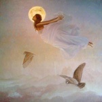
    mudra wrote:Although I love ET's banner I think it does'nt carry enough depth nor contrast once put on.
    No where in that picture does one get the impression that one is going to get out of these mists .

    The picture used in NWK's banner gives more space which I like and
    color wise it's soft and dynamic at the same time .
    I like the sword placed almost in the middle of it balanced by the immaterial feminine
    vibrations that surround it .

    I found annother picture here which is lovely too ..Look at this:
    http://www.ph-ludwigsburg.de/html/2b-frnz-s-01/overmann/baf4/bretagne/excalibur1.jpg
    ( I give the link to it as it is big and SiriArc that is on dial up will be slowed down to download it to see it )
    What do you think of that one ?
    Could have softer colors but the scenery is grand I think .

    Love from me
    mudra

    Yes mudra this is nice. I could try taking some elements from it (i.e the sword and the water) and putting that into the one i created. Also i could use the figure or the unicorn? what do you think.. it is nice but the colours strong and need to be softened.

    NWK.
    mudra
    mudra


    Posts : 23207
    Join date : 2010-04-09
    Age : 69
    Location : belgium

    New banners, Members please take a look and decide - Page 2 Empty Re: New banners, Members please take a look and decide

    Post  mudra Fri Apr 16, 2010 5:39 am

    I agree about the colors and I really like the scenery of the banner you are working on
    as it gives space .. but yes elements of this picture I gave the link to as the unicorn and sword could be used from it .
    Have a try and thank you so much for your patience and dedication on this .
    And yes I would love to see your banner put up to so we can see how it looks and feels.

    New banners, Members please take a look and decide - Page 2 934918

    Love from me
    mudra
    NewWorldKarma
    NewWorldKarma


    Posts : 56
    Join date : 2010-04-10
    Age : 39
    Location : England

    New banners, Members please take a look and decide - Page 2 Empty Re: New banners, Members please take a look and decide

    Post  NewWorldKarma Fri Apr 16, 2010 9:31 am

    Thank you. Dedication is key, passion is also key.. just want something that looks nice and represents the forum as a whole. So when it doesnt look right people should challenge so i can change it, it would be good if all of us here had the same kind of mindset for the image lol, we all like different things Razz

    See what i can come up with later Mudra.

    I love you
    NWK.
    Bobbie
    Bobbie


    Posts : 108
    Join date : 2010-04-09
    Location : Mystery Mesa, LA County, CA

    New banners, Members please take a look and decide - Page 2 Empty Re: New banners, Members please take a look and decide

    Post  Bobbie Fri Apr 16, 2010 9:32 am

    Me too - I would like to see how NWK's banner looks in place. While I like the aspect of people being in the mists on E.T.'s banner - this particular image is almost too distorted and misty to get the sense that there are people standing there. At first glance it's intriguing, watery, beautiful but it's difficult to figure out what it is I'm looking at - either that it is Avalon or real mist - rather too CGI.

    These are only thoughts/opinions and not criticisms. My nature is to be very anal about balance (sorry, it's the dna from somewhere). It's crazy but I even re-arrange furniture in a hotel room if it's not in the right place. Visually unbalanced things nag at me. I try to ignore it but have been largely unsuccessful.


    mudra wrote:I agree about the colors and I really like the scenery of the banner you are working on
    as it gives space .. but yes elements of this picture I gave the link to as the unicorn and sword could be used from it .
    Have a try and thank you so much for your patience and dedication on this .
    And yes I would love to see your banner put up to so we can see how it looks and feels.

    New banners, Members please take a look and decide - Page 2 934918

    Love from me
    mudra
    Carol
    Carol
    Admin
    Admin


    Posts : 31679
    Join date : 2010-04-07
    Location : Hawaii

    New banners, Members please take a look and decide - Page 2 Empty Re: New banners, Members please take a look and decide

    Post  Carol Fri Apr 16, 2010 11:20 am

    Please keep in mind that we will be rotating the banner and there is room for everyone's ideas and concepts. I like it where we create it together and I also like some of the original work that some of the members have put forth. So let's work together on this in concert.

    NWK's original work was also good and we did have it up before the members came on board but the colors clashed with the current skin color so Mercuriel used the banner he created which I love also. And I liked the artwork of dan's son and the font he used but that link I believe is at PA1.
    Bobbie
    Bobbie


    Posts : 108
    Join date : 2010-04-09
    Location : Mystery Mesa, LA County, CA

    New banners, Members please take a look and decide - Page 2 Empty Re: New banners, Members please take a look and decide

    Post  Bobbie Fri Apr 16, 2010 11:40 am

    Oh that's great and a good idea Carol - about rotating the banners. I even like NWK's signature banner - with a different font. The colors are beautiful and give a general feeling of uplifting though a little more mists could make it a little mysterious.

    Carol wrote:Please keep in mind that we will be rotating the banner and there is room for everyone's ideas and concepts. I like it where we create it together and I also like some of the original work that some of the members have put forth. So let's work together on this in concert.

    NWK's original work was also good and we did have it up before the members came on board but the colors clashed with the current skin color so Mercuriel used the banner he created which I love also. And I liked the artwork of dan's son and the font he used but that link I believe is at PA1.
    mudra
    mudra


    Posts : 23207
    Join date : 2010-04-09
    Age : 69
    Location : belgium

    New banners, Members please take a look and decide - Page 2 Empty Re: New banners, Members please take a look and decide

    Post  mudra Fri Apr 16, 2010 11:45 am

    I am finding the idea of having several banners rotating excellent New banners, Members please take a look and decide - Page 2 Icon_cheers
    In that way we can meet all souls vibrations .

    Love from me New banners, Members please take a look and decide - Page 2 Herz
    mudra
    Mercuriel
    Mercuriel
    Admin
    Admin


    Posts : 3497
    Join date : 2010-04-07
    Location : Walking the Path...

    New banners, Members please take a look and decide - Page 2 Empty Re: New banners, Members please take a look and decide

    Post  Mercuriel Fri Apr 16, 2010 12:28 pm

    Actually I'm just messing around until We get a Final Carol likes...

    Heh heh


    _________________
    Namaste...

    Peace, Light, Love, Harmony and Unity...
    Anonymous
    Guest
    Guest


    New banners, Members please take a look and decide - Page 2 Empty Re: New banners, Members please take a look and decide

    Post  Guest Fri Apr 16, 2010 2:54 pm

    Ok Carol, thank you for your kind words and the beautiful creative ideas shining through you ...i can especially imagine the rainbow colored bridge letters over the heart pattern. That would lighten it a lot ..
    But some people might say it's 'too sweet' . It depends a lot on decency .
    See if i can find more pics ?

    No spaceships this time ? Just make it all to spaceship here .. hope we can fly away .
    Mudra, you are right there about 'mists from where one never comes out' . That's about me at the moment..

    I come back..mist in fronts mists behind me..

    New banners, Members please take a look and decide - Page 2 Icon_sunny
    Anonymous
    Guest
    Guest


    New banners, Members please take a look and decide - Page 2 Empty Re: New banners, Members please take a look and decide

    Post  Guest Fri Apr 16, 2010 2:55 pm

    I have little eye problem from starring to the computer, it just needs few nights of good sleep New banners, Members please take a look and decide - Page 2 Icon_flower
    mudra
    mudra


    Posts : 23207
    Join date : 2010-04-09
    Age : 69
    Location : belgium

    New banners, Members please take a look and decide - Page 2 Empty Re: New banners, Members please take a look and decide

    Post  mudra Fri Apr 16, 2010 2:58 pm

    E.T. wrote:
    No spaceships this time ? Just make it all to spaceship here .. hope we can fly away .
    Mudra, you are right there about 'mists from where one never comes out' . That's about me at the moment..

    I come back..mist in fronts mists behind me..

    New banners, Members please take a look and decide - Page 2 Icon_sunny

    LOL ET I believe we will take the Mists with us as we fly away sunny

    Love from me
    mudra
    Anonymous
    Guest
    Guest


    New banners, Members please take a look and decide - Page 2 Empty Re: New banners, Members please take a look and decide

    Post  Guest Fri Apr 16, 2010 3:20 pm

    Oh you know..mists are mystical , like the Primordial Myth of Creation of Life ...somewhere , faraway in the Universe..the Craddle of Life that gives birth to form of beings ..
    Now the banner of course, if it's too misty ..
    I forgot myself somewhere in my mind, i'll come back after i reach enlightenment ok ?

    The computer decided to play Dr Greer in Barcelona. It does it sometimes, glitch lol

    Shanti Om ..
    New banners, Members please take a look and decide - Page 2 232749
    devakas
    devakas


    Posts : 2038
    Join date : 2010-04-10

    New banners, Members please take a look and decide - Page 2 Empty Re: New banners, Members please take a look and decide

    Post  devakas Fri Apr 16, 2010 3:42 pm

    I was thinking if new members know the legend of our name of the forum. ...
    Wow Carol, it is beautiful picture and you are an artist. I love this picture.
    love to all mistified workers here....
    NewWorldKarma
    NewWorldKarma


    Posts : 56
    Join date : 2010-04-10
    Age : 39
    Location : England

    New banners, Members please take a look and decide - Page 2 Empty Re: New banners, Members please take a look and decide

    Post  NewWorldKarma Fri Apr 16, 2010 7:26 pm

    Bobbie wrote:Me too - I would like to see how NWK's banner looks in place. While I like the aspect of people being in the mists on E.T.'s banner - this particular image is almost too distorted and misty to get the sense that there are people standing there. At first glance it's intriguing, watery, beautiful but it's difficult to figure out what it is I'm looking at - either that it is Avalon or real mist - rather too CGI.

    These are only thoughts/opinions and not criticisms. My nature is to be very anal about balance (sorry, it's the dna from somewhere). It's crazy but I even re-arrange furniture in a hotel room if it's not in the right place. Visually unbalanced things nag at me. I try to ignore it but have been largely unsuccessful.


    mudra wrote:I agree about the colors and I really like the scenery of the banner you are working on
    as it gives space .. but yes elements of this picture I gave the link to as the unicorn and sword could be used from it .
    Have a try and thank you so much for your patience and dedication on this .
    And yes I would love to see your banner put up to so we can see how it looks and feels.

    New banners, Members please take a look and decide - Page 2 934918


    Love from me
    mudra

    i can be the same too.. i like to move things sometimes otherwise its in the back of the head until you do.

    NWK.
    SiriArc
    SiriArc


    Posts : 426
    Join date : 2010-04-11
    Location : Denver

    New banners, Members please take a look and decide - Page 2 Empty A Blend (From NWk Technique)

    Post  SiriArc Sat Apr 17, 2010 3:14 am


      Current date/time is Fri Apr 19, 2024 12:09 pm